Redesigning Kiwi.com's My Trip Page and the forty features that live within it.
The ‘My trip’ page is the starting point for every Kiwi.com user that wants to do anything after they have booked their trip. It’s the place where users can check their itinerary, see their check-in status, access their flight, train or bus tickets, buy ancillaries like baggage, seating or insurance, change their passenger details and much more.
Over time, this complex ‘home of many features’ became difficult to navigate, causing many problems that resulted in users being frustrated. I lead the project in which we redesigned the page itself and most of the features that live inside. The result is a more intuitive, organised and adaptive environment that helps users with all their ‘post-booking’ needs and wishes.
Over time, this complex ‘home of many features’ became difficult to navigate, causing many problems that resulted in users being frustrated. I lead the project in which we redesigned the page itself and most of the features that live inside. The result is a more intuitive, organised and adaptive environment that helps users with all their ‘post-booking’ needs and wishes.
The jobs to be done
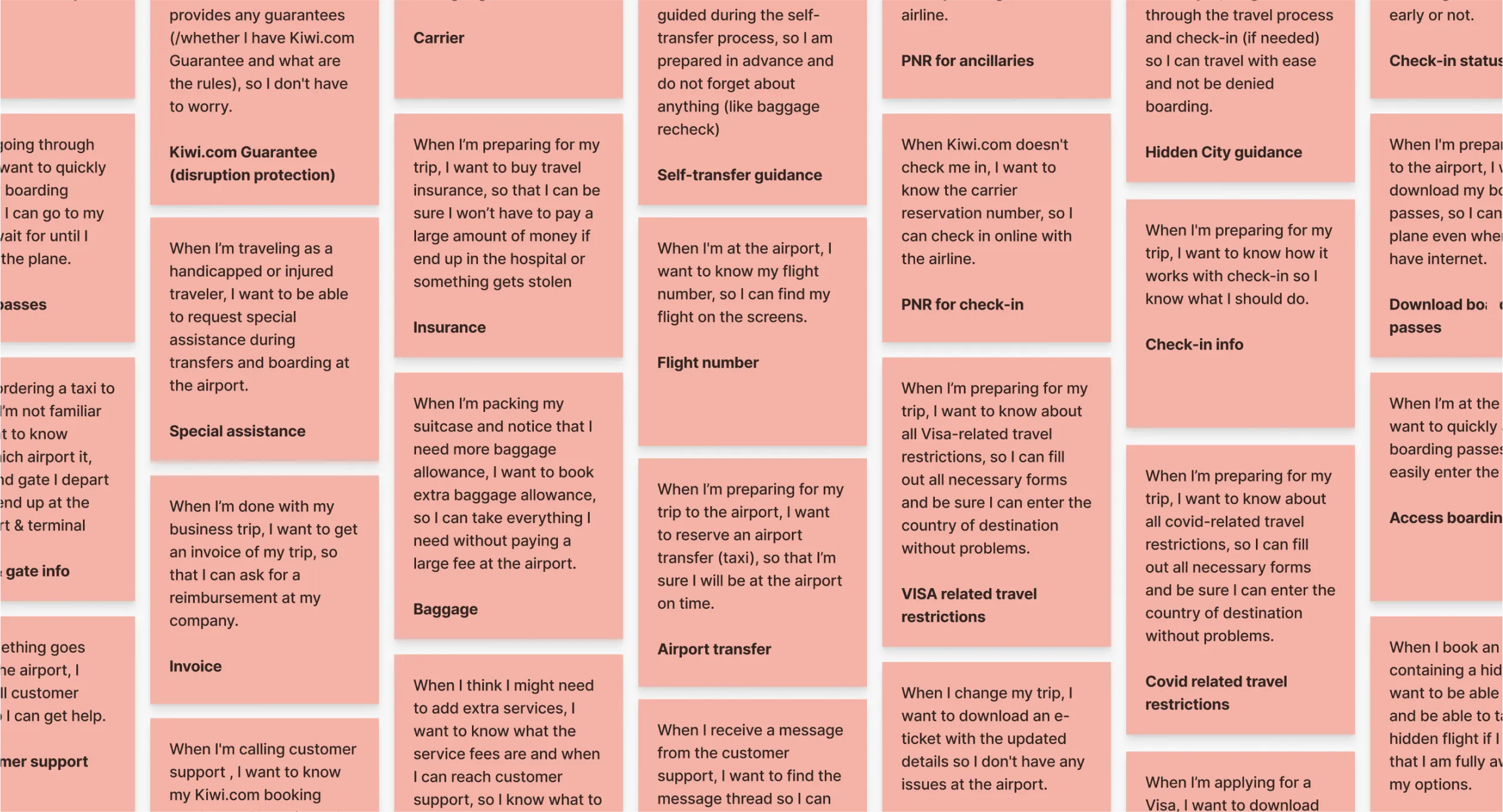
We knew (from both our own experience as from UX research) that the information architecture of the original page was a mess. To create a better one, I started with gathering all the ‘job stories’, this allowed me to sum up everything the user might want or need to do, without directly connecting it to existing features or pieces of user-interface.
When I mapped all of them, I gathered some relevant co-workers in a workshop and had them cluster these job stories. After we had created four different cluster, we collaboratively merged them back into one ‘final’ cluster. This cluster formed the base of the new information architecture that I used for the redesign.
When I mapped all of them, I gathered some relevant co-workers in a workshop and had them cluster these job stories. After we had created four different cluster, we collaboratively merged them back into one ‘final’ cluster. This cluster formed the base of the new information architecture that I used for the redesign.
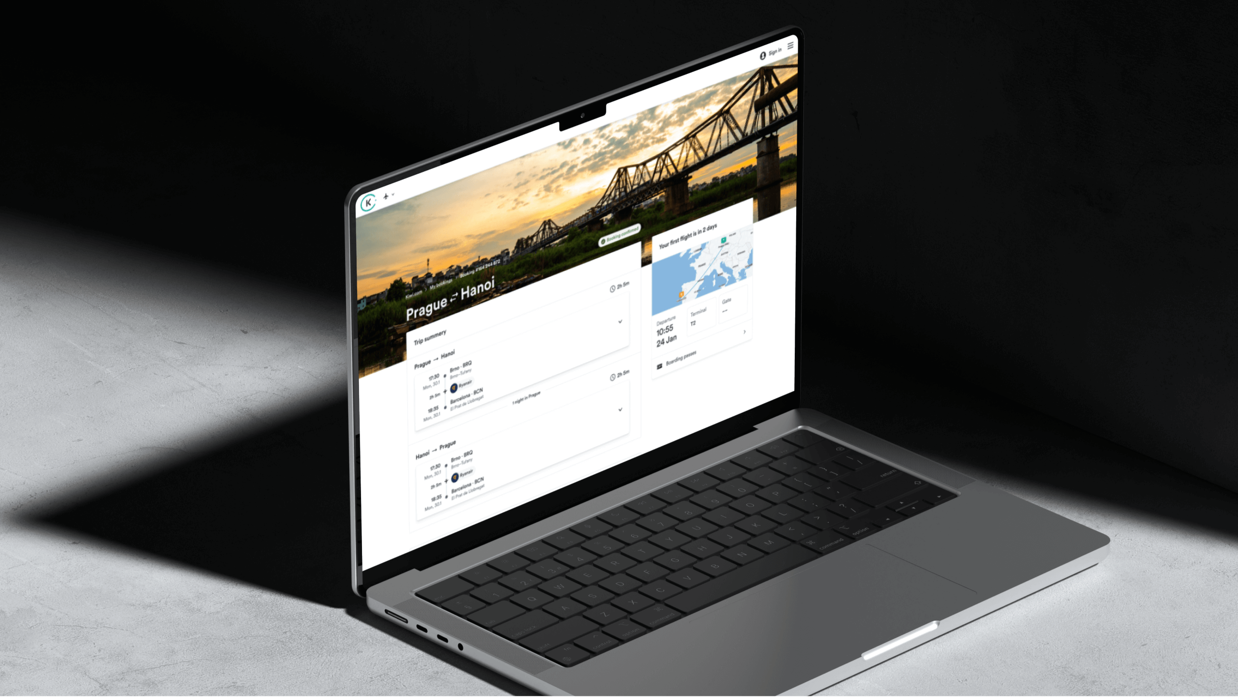
Designing the overview page
With the new information architecture in mind, I started designing the new overview page. I started with laying out the overall structure without worrying too much about each individual section. From there I started designing adding more detail to each section, covering all the different states and edge cases that the section can have.
I designed the page with the use of the Orbit, the design system build by Kiwi.com. It helped me design a page that was aligned with the rest of our digital product while at the same time allowing me to move quickly.
I designed the page with the use of the Orbit, the design system build by Kiwi.com. It helped me design a page that was aligned with the rest of our digital product while at the same time allowing me to move quickly.
Creating the microsite template
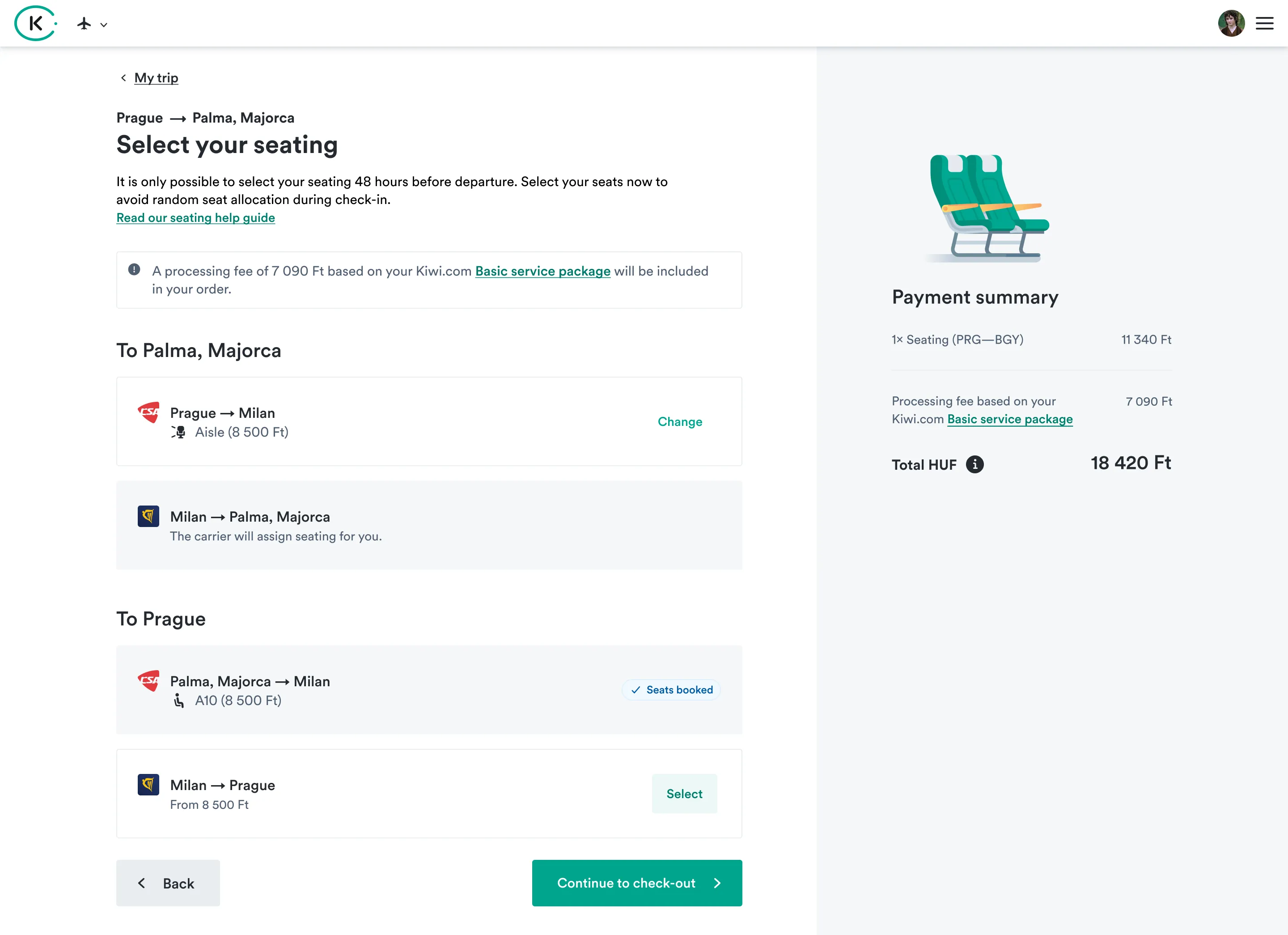
From the new My Trip page, we are linking to a bunch of different ‘subpages’ we call micro-sites. While each new microsite we created could be described as a project on it’s own, I also designed a template in which these microsite would be designed. This way (designers from) other teams could take this template as a starting point to help them create something that’s relatively easy to implement and aligns with the other micro-sites we have on the product.
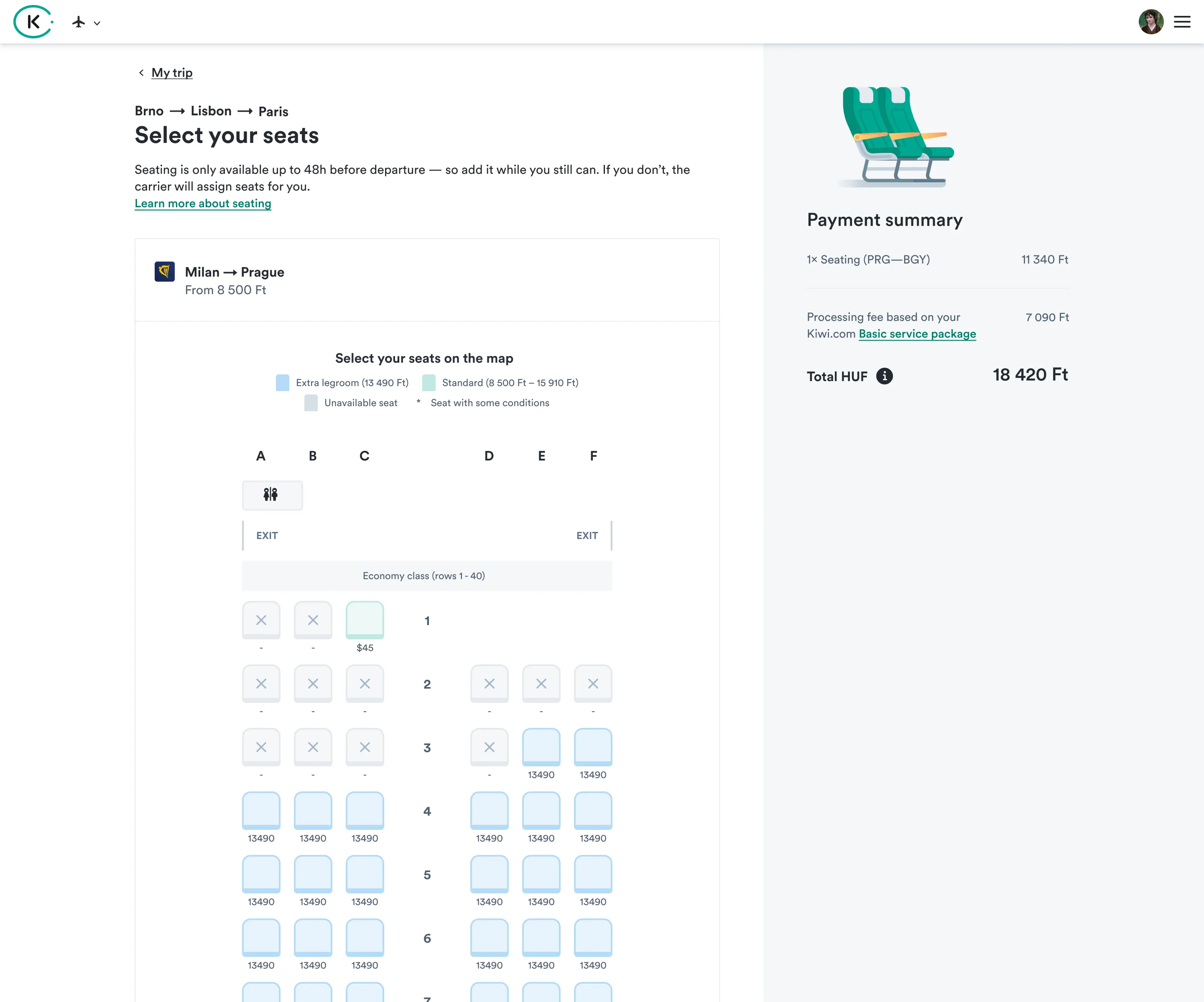
An example of a microsite is the ‘seating micro-site’. This is the place users go to to purchase seats. While the content of the page was designed by another team, they used my design template to create it.
An example of a microsite is the ‘seating micro-site’. This is the place users go to to purchase seats. While the content of the page was designed by another team, they used my design template to create it.

Did you like this project?
let’s get to know each other and chat about doing a similar project of our own.
Phone
+31 6 48 66 18 00Email
Send an email